This page contains some additional notes about the topic, which I will expand on as I see fit.
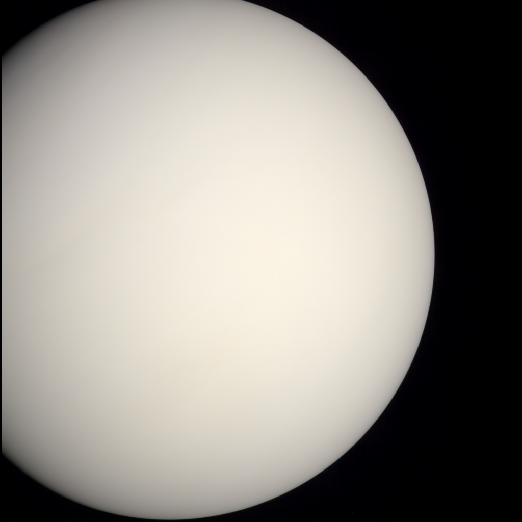
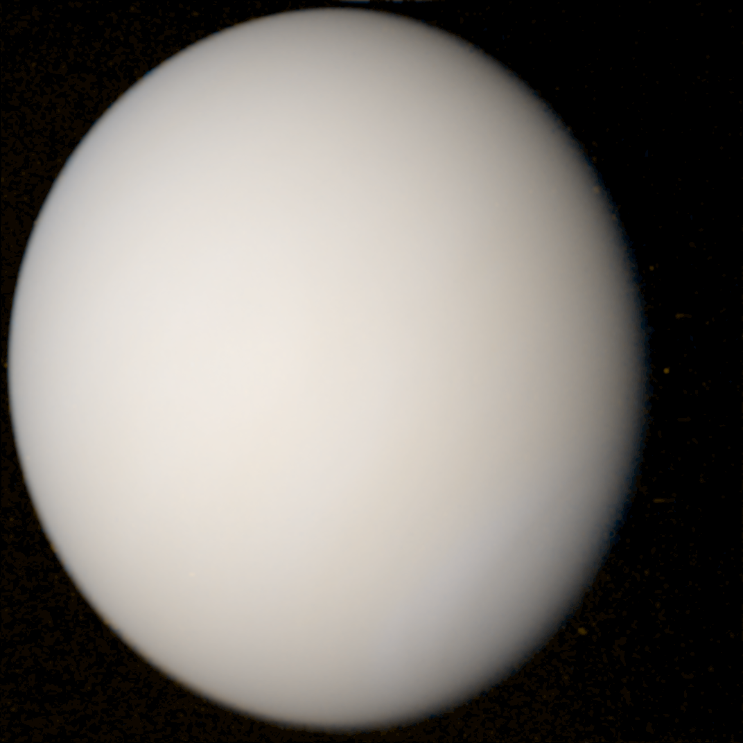
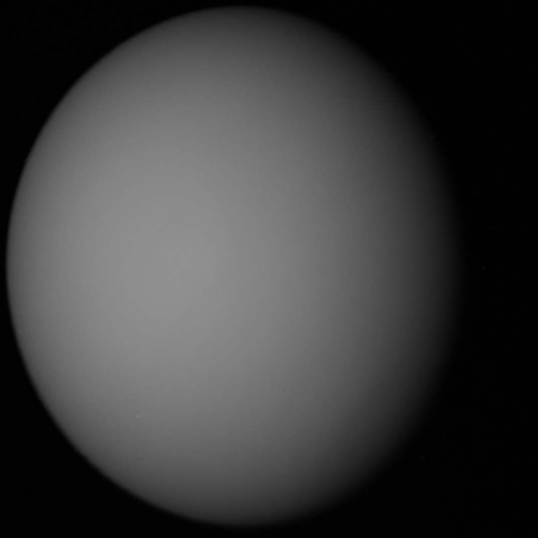
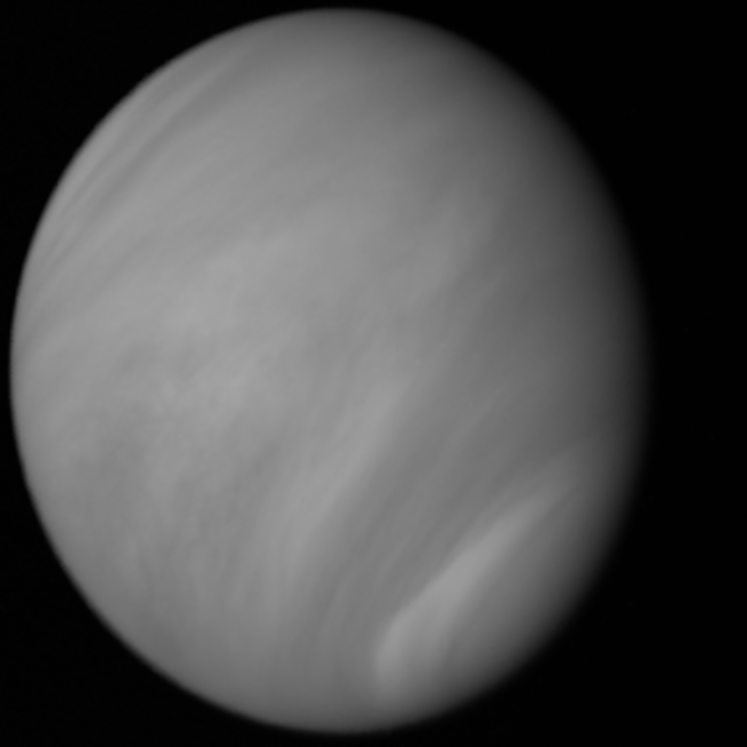
Images of Venus I reconstructed from MESSENGER and Mariner 10 data respectively.
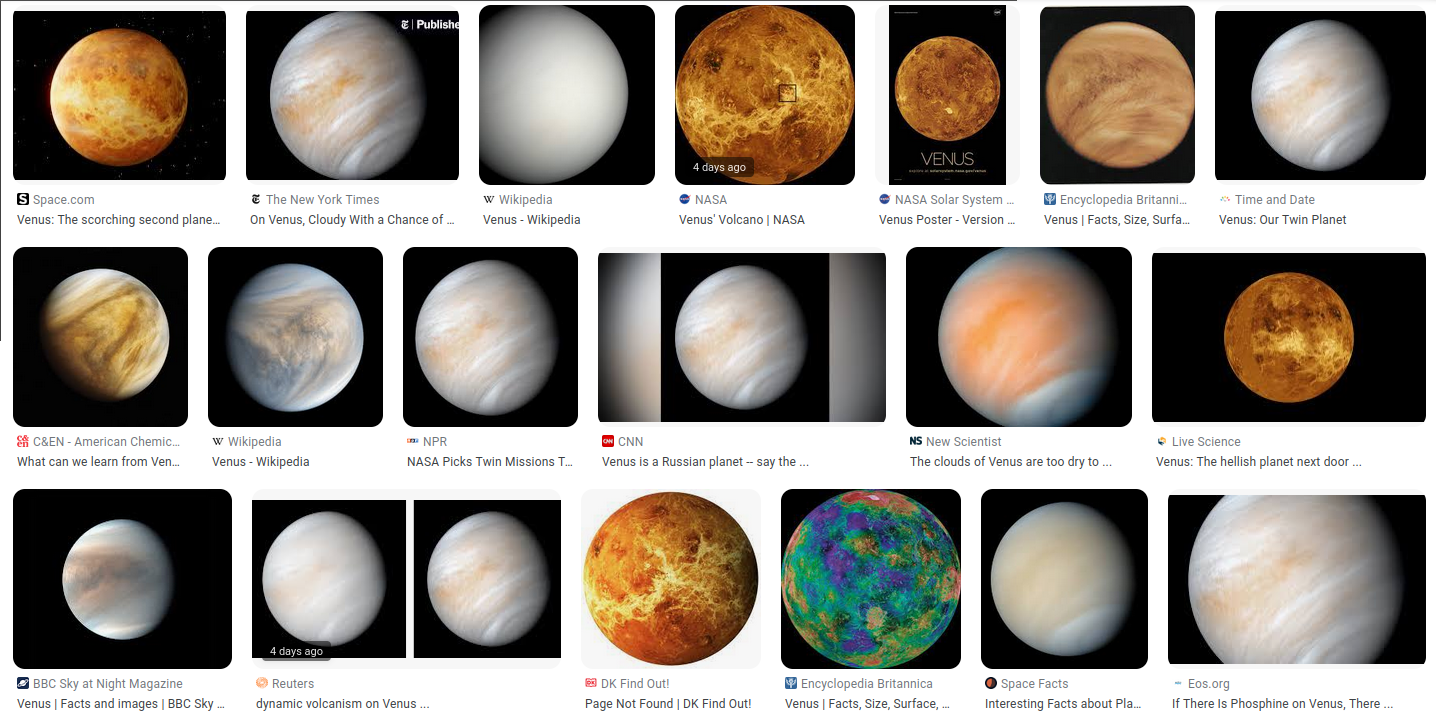
If you look up pictures of Venus, you'll find a lot of variation in how it looks between images, moreso than any other planet:

From Google Images on 20 March 2023.
This struck me as odd, so I decided to look into the origins of some of the more popular ones to figure out which, if any, most accurately depicts Venus in "true color", in the sense of which most closely matches what you would actually see if you visited the planet yourself.
I explored the images of Venus in more detail in
my video, but as for what it should look like in true color, the jist is that the clouds of Venus are very close to white in appearance, with a slight yellowish tint, as can be seen in the images at the top of this article, and there isn't much structure that can be seen in them, giving the planet the appearance of a solid orb. However, in the lower atmosphere of Venus, there's something
[1]Though what specifically is unclear. See the paper "Venus Upper Clouds and the UV Absorber From MESSENGER/MASCS Observations" for more information. that absorbs a significant amount of ultraviolet light rather than reflecting it, so when Venus is imaged through an ultraviolet filter more structure can be seen, with the lighter patches being clouds of sulphuric acid in the upper atmosphere which reflect more evenly in ultraviolet and visible light:
Left: Venus through a yellow filter, Right: Venus through a UV filter, both taken by Mariner 10.
A consequence of this is that when missions have been sent to image Venus, they've prioritized capturing images in ultraviolet, as that provides the most useful results for studying the rotation and structure of Venus's atmosphere, and in turn these ultraviolet images are the ones most often presented to the public. And when these images are presented, the planet is generally depicted with a yellow hue, even if the data used to compile the image only had a single channel. In reality, Venus is much closer to white in color, though the only widespread depiction I could find of this was
an image compiled from MESSENGER probe data by Gordan Ugarković in 2009. The goal of the video was to explore how this and other images were derived from the original data, and in doing so I made my own attempt at synthesizing an image of Venus with its color depicted as accurately as possible based on the data.
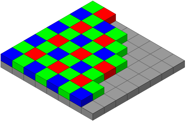
Something I didn't explore in the video is how imaging systems on space probes differ from digital consumer cameras. Typically, a consumer camera will capture the red, green, and blue channels of an image simultaneously, by overlaying a color filter array (such as the Bayer filter seen below) in front of the digital sensor. On scientific equipment, it's more typical to have each channel captured seperately, with a solid filter placed over the entire sensor, then swapped out for another filter to capture an image in a different color. This has several advantages for scientific data, such as avoiding the step of demosaicing, which algorithmically converts the single image obtained by the sensor of a camera into a three channel color image, and can result in some noise and color artifacts. The loss of simultaneity between the frames isn't much of an issue in this case, as in space things tend to be moving slow enough that having a few seconds or even minutes between images doesn't make much of a difference and can be accounted for when it does.

It's also important to remember that capturing a color image isn't exactly the goal of these missions anyway; The goal is to return data with scientific value, and the creation of three-channel color images is generally done to show that data in a way that's readable, but not necessarily true to what people are used to a color image representing. A good example is the famous
Pillars of Creation image created by Jeff Hester and Paul Scowen using data from the Hubble Space Telescope. The red, green, and blue channels correspond to detection of the wavelengths emitted by singly-ionized sulphur, hydrogen, and double-ionized oxygen respectively, and thus have little to do with color as we understand it.
The Pillars of Creation in the Eagle Nebula taken by the Hubble Space Telescope in 1995, sourced from Wikimedia Commons
As a less extreme example, there's the
"High-resolution enhanced-color global MVIC portrait of Pluto" created by Alex Parker in 2015, which uses New Horizon's NIR, Red, and Blue filters as the sources of the red, green, and blue channels of the final image. This makes it a color image, but not what I would call true color.
To get a true color image, there are two approaches you can take. Either:
1. Choose filters as close to red, green, and blue (as seen by human eyes) as you can get, and stick those into the three channels of your image
or
2. Interpolate between the available images to reconstruct spectra at each point, which can then be used to approximate the CIE XYZ tristimulus values and sRGB color of each pixel
This second option is explained in more detail
here by Gordan Ugarković on the Unmanned Spaceflight forum, and is the method I used to reconstruct the images I presented from MESSENGER and Mariner 10 data. It's not a flawless way of doing things, as it requires you to make assumptions about the curve outside of the filter wavelengths you have available, and when working with broader filters, such as the UV filter from MESSENGER, there's ambiguity about which particular wavelength the image you have is most representative of.
In the case of my images, I used a linear interpolation between the filters for the MESSENGER image, with the assumption that the radiance would slope towards zero at 1200nm and 300nm. For the Mariner image, I placed the yellow, blue, and UV filters at 575nm, 475nm, and 380nm, and manually adjusted the gamma correction of each to fit the colors of the MESSENGER image, as I lacked flat-field and dark images to use as a reference.
For the MESSENGER image, I had access to a set of data which had already been calibrated and corrected using
methods described here, published after the MESSENGER probe had completed its mission, so it was not available to Ugarković when he compiled his image of Venus in 2009. Instead, he used images the probe captured of the Earth and Moon in flight to calibrate the data, though I could not confirm the exact methodology he used. Regardless, the results from these two methods are not too different visually:
The image I compiled from Mariner 10 data
[2]Shown at the top of this page, but also here: "https://geobica.com/images/venus_interpolated_mariner_10.png, by contrast, does not have any scientific rigor and was made entirely so that I'd have an image of the entire disk instead of one that was cut off on the left.
